Keeping up to date with new web technologies
Be at the forefront too!
The use of new web technologies is nowadays essential to stay up to date in the digital age. It is important that companies and individuals are always open to new technologies and trends in order to keep up with the competition.
One of the benefits of new web technologies is that they improve the user experience and enable better, faster and more effective interaction with users. New technologies such as AMP (Accelerated Mobile Pages) ensure that websites load faster, which has a positive impact on user experience and search engine rankings.
In addition, new technologies also offer more security for websites as well as improved compatibility with different devices and browsers. One example is the use of HTTPS encryption to protect the connection between users and the website.
To stay up to date, companies and individuals should actively keep themselves informed about new technologies and trends and integrate them into their strategies. This can be done through training, conferences or technical literature. Investing in new web technologies pays off in the long run by increasing effectiveness and providing a better customer experience.
What is "responsive web design"?
Responsive web design is a type of web development that ensures a website is suitable for all screen sizes, device types and resolutions. It is a technique that allows a website to be displayed optimally on all devices without a separate layout. The idea behind this is that the same HTML document is used on all devices, but it can automatically adapt to provide the best possible display.
A classic example would be when a website is displayed on a desktop computer with 3 columns (header, content and sidebar). However, if the same website is displayed on a smartphone, the website would need to fit into a single block of content. Responsive web design, in such a case, automatically adjusts content on a page to fit the screen size so that the content is still displayed in a meaningful way.
As user habits are constantly changing, responsive web design is of enormous importance. With a variety of devices, screen sizes and resolutions, a website must also ensure that it is optimally displayed on all end devices. Responsive web design provides the solution to these requirements. It also allows web developers and designers to work more flexibly and efficiently by using only one design for all devices. Responsive web design is therefore indispensable when you want to ensure that a website works on all devices and offers a positive user experience.
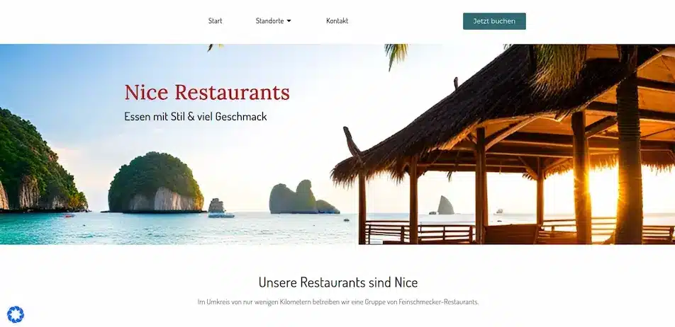
Image: Example of responsive web design: View of the website on computer screens in landscape format.
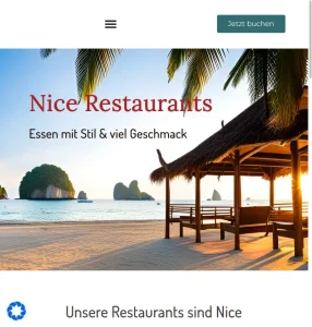
Image: Example of responsive web design: View of the same website on tablet screens in portrait format.

Image: Example of responsive web design: View of the same website on mobile phone / smartphone screens in portrait format.
What does flexbox and grid design technology mean in web design?
Flexbox and grid design technologies are two important concepts in modern web design. They enable web designers to work effectively and efficiently and to create appealing layouts.
Flexbox is a technology that allows designers to flexibly place elements within a container. With this technology, they can align elements horizontally and vertically without affecting the size of the elements. It is particularly useful for creating navigations, footers and flexible content elements.
Grid design technology, on the other hand, provides a grid layout that facilitates the designer workflow by positioning elements in relation to their container. It allows designers to tackle complex tasks such as creating responsive layouts by organising them into columns and rows.
Overall, flexbox and grid design technology allow designers to work with content and allow them to create complex layouts quickly and effectively, creating user-friendly and responsive websites.
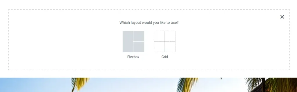
Image: Example of the use of flexbox and grid design technology in the Elementor editor.
Contact us now - this is the best way to reach us
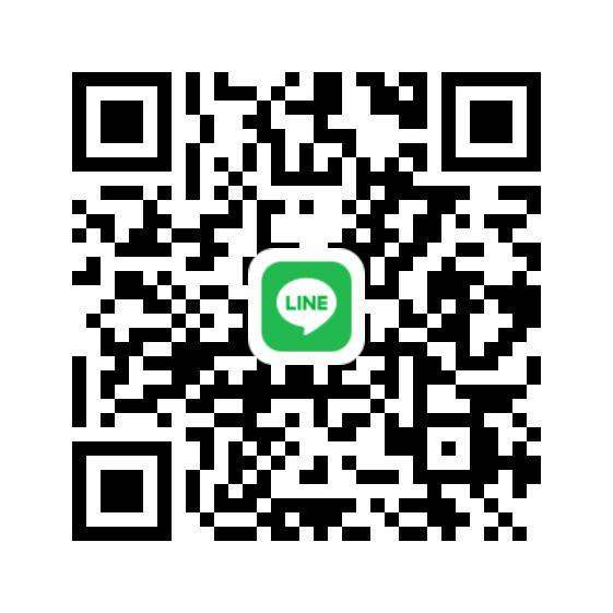
Our line messenger QR code for contacting us
Line Messenger already has over 500 million downlods
What can you expect from us in the next post?
In the next web design blog posts, we will introduce you to our topics and fields of activity in a little more detail.
In addition to web design and website support, this also includes setting up an online shop. We like to use WordPress and WooCommerce for this, or if a more extensive merchandise management system is required, also with JTL-Shop and JTL-Wawi from JTL-Software.
We look forward to it!
